Welcome to our newly redesigned website! This has been a huge, wonderful project spanning many months of planning and execution. This blog post is dedicated to dissecting the key elements of the redesign process that I found most interesting and challenging.
Revisiting History — Drawing inspiration from the past
Although I did not design the previous iterations of the Hop Studios website, I wanted to ensure that the new design represented the company’s origin and growth properly. I poured through previous designs and analysed the placement of elements and content; what changed, and what stayed the same? I wanted to make wise design decisions that wouldn’t repeat past mistakes or make new ones. If you’re curious, many of the site’s older designs can be accessed through the Internet Wayback Machine.
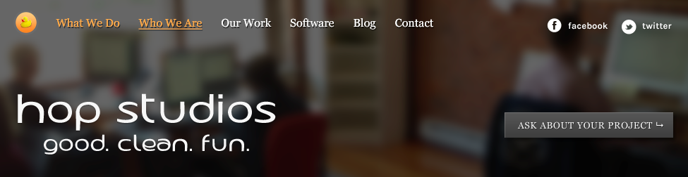
This idea made it to final stage. Its results can be seen on our homepage.
Through this process I took elements not only from the official Hop Studios website, but also our founders’ websites. For a good chunk of Hop Studios’s history, they made up 100% of the company.
Notable Inspirations
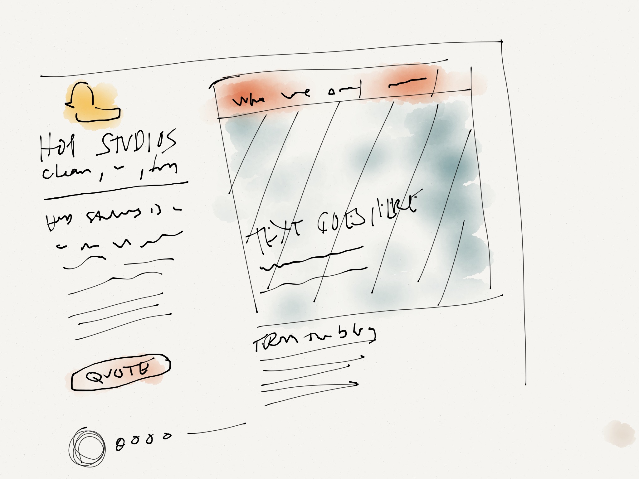
- The “Who We Are” page took inspiration from Susie’s gadgets page with photos.
- For the “What We Do” page, centering the content is based off of the old “Who We Are” page circa 2007 (see: Archived version of /whoweare.html)
- The image assets and page elements mostly remain the same, in order to minimize the effort of converting to the new site; more on that below.
Have you noticed any other influences from the old design in the new one? Let us know in the comments section below.
Starting from scratch — Reuse and Recycle
With elements obtained from previous site redesigns in a basket of ideas, I set out to design (not redesign) each major part of the site. Perhaps the most difficult aspect of this was to find an elegant way to reuse the existing assets. (That, and maybe the duck).
Reusing assets means less work on the production side, but more limits for designers! However, keep in mind that with the right creativity, and a good developer, you can get really funky. In our case, the recycling of the design overview assets was a huge success. The layout and organization for the thumbnails of the non-featured clients was just as easily reusable.
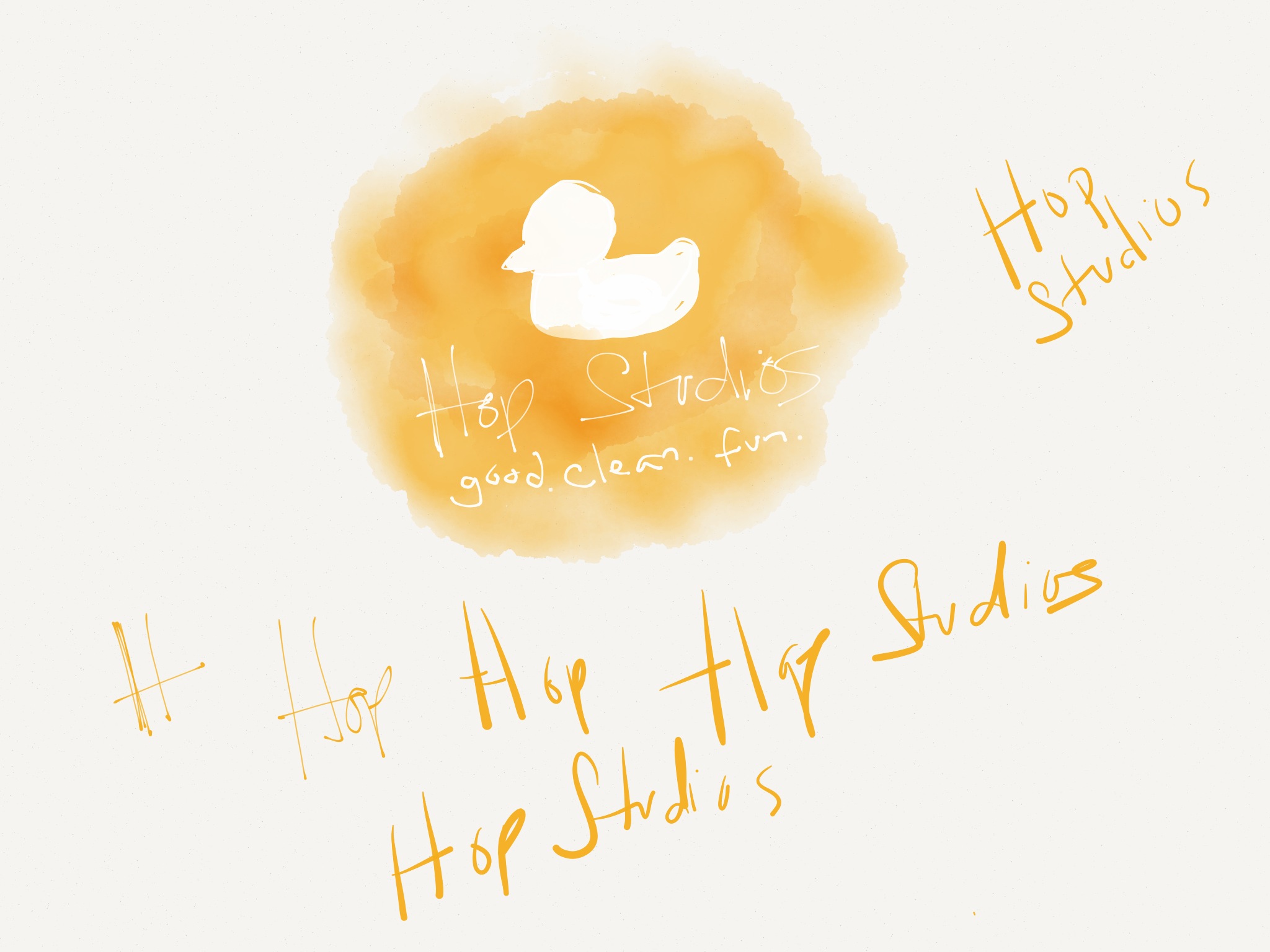
The Hop Studios duck—what is her name, anyway?—is gorgeous. Her perky pose generates interest and the duck’s eyes have a cute angle. But the question was: where should we place our beloved duck? Originally, she was going to be a part of the navigation area, but within our inner pages it was so small (see above) and.. too big (see below).
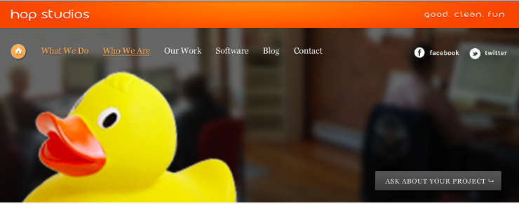
The answer, if not the solution, was to fit the duck where her presence is not going to compete with any other element. Personally, I really wanted to have the duck in the header — she is so important to our identity. But as the design evolved, it became clear the best new placement was not on top of every page, but instead at the end of every page and displayed prominently on the homepage, tying the site together from start to finish.
Inner-page dilemma — Must all inner pages look the same?
Typical design projects include a single inner-page design, with variations, that do not have much flexibility in layout. In this design, our inner pages follow several quite diverse layouts custom tailored to the content they serve. In some top restaurants, each dish may have its own shaped plate to hold the food, plated in a certain perfect way. A shallow bowl for soup, a plate with a lip (not to be confused with a lip-plate) for a steak.
The Software and Client pages have their secondary navigation element on the left hand side of the page, while our blog page has these navigational elements on the right side of the page. The purpose of these changes was not to be disharmonious but rather to ensure that each section gets the best treatment for the way visitors will digest the content. The software and client pages, for example, often have a visual element to them, such as the design overviews or thumbnails. Meanwhile, our blog will be mostly a wall of text content. Furthermore, the client and software pages change to a layout using the right column navigation on each of their detail pages, which are designed with text-heavy content in mind.
Unifying each page into a cohesive look is not achieved here by the repetition of layout, but rather by specific styles and elements used consistently.
The original design idea for the Hop Studios website was a two column layout, with a thinner left column for navigation and a wider right column where the content would be placed. This design didn’t work for this particular project because the “our work” pages needed to reuse assets that looked misplaced on this design.
Conclusion
History, recycling, variation — the big three touchstones for the Hop Studios site redesign. Looking back—farther than just the current thing you’re redesigning—allows for a designer to get (re)inspired by elements that maintain the identity of the brand, whether it be a subtle image roll-over effect or choice of colour palette. Reusing elements from a previous design can be challenging—even limiting—but ultimately can result in a design which not only saves a lot of time or money but can help maintain the integrity of the brand. Finally, designing significant layout variations for different types of content presents the content more effectively, and gives the site a much “bigger” feel than it would have if it were all of one variety.
What do you think of our redesign? Which layout is your favourite? Let us know in the comments below.
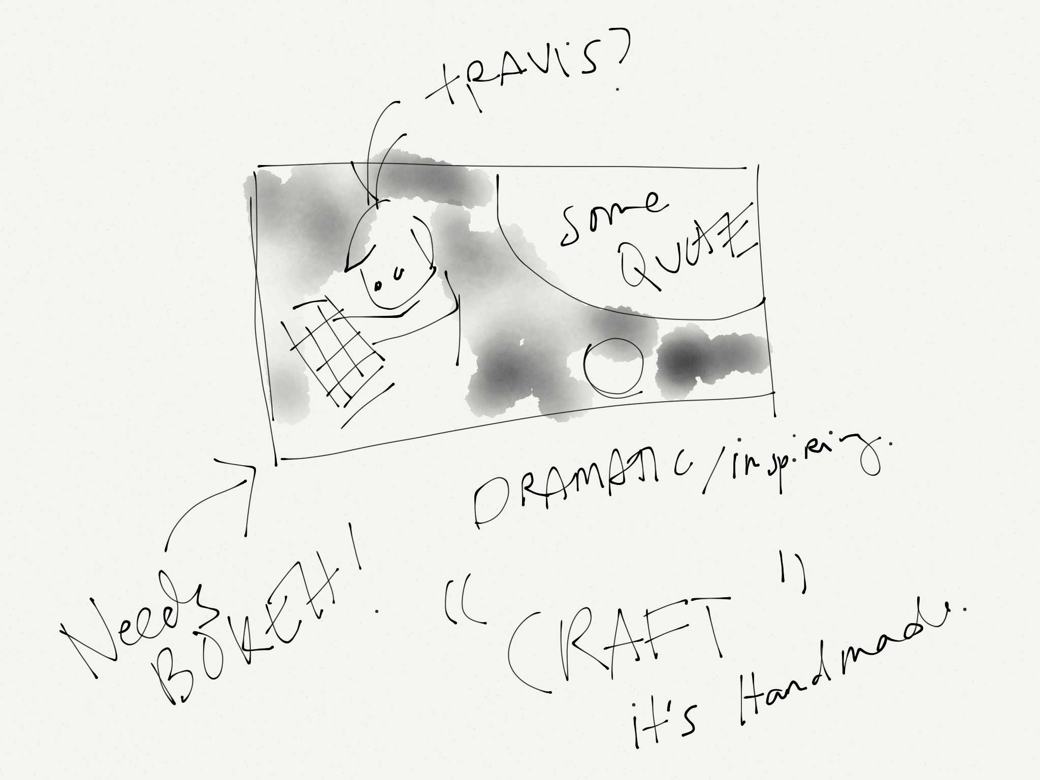
The who we are page was going to initially have the same rounded rectangle shape as the old who we are page, with a space for a quotation and a look that is more hand crafted by using various kinds of paper textures.

Comments